In the Creating Palette Windows tutorial we looked at the definition of palette windows using the components object. To learn more about such interface components, let's have a closer look at the components object first:
// First we define the interface components
var components = {
	firstName: { type: 'string', label: 'First Name' },
	lastName: { type: 'string', label: 'Last Name' },
	email: { type: 'string', label: 'Email Address' }
};

// Now we create the palette window
var palette = new Palette('Contact Details', components);
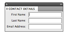
In this code we are defining a components object with the three properties firstName, lastName and email.
Each of the defined components are nested objects themselves and look like this:
firstName: { type: 'string', label: 'First Name' },
With this simple notation we are asking to produce an input field for entering a String value, so a line of text. We are also telling it to display a label next to it that says 'First Name:'. The ':' is automatically added by Scriptographer.
The commas between the properties are necessary, except after the last definition, where it should be left out. If these commas are omitted, the JavaScript engine will display an error.
This definition is then used to compose the palette window when new Palette(title, components) is called:
// Now we create the palette window
var palette = new Palette('Contact Details', components);
Components Types and their Values
Many different types of components are supported, not only string. The possible values for type are: 'string', 'number', 'text', 'boolean', 'button', 'slider', 'list', 'color', 'font' and 'ruler'. In this tutorial we go through them one by one, show example code and describe the additional properties that each type can receive.
In addition to the default properties type and label, all components support the property value, defining the value to initially be displayed and also returned if it remains unchanged. A more flexible way of providing values is through the values object, as described by the chapter Separating Values from Component Definitions. For simplicity, we use the the value property in the examples below.
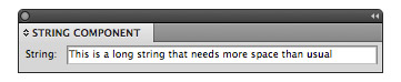
String Components
As we saw in the example above, string components are edit fields that contain one line of text. In addition to the standard properties, they can define the length property, specifying the field's width in average amount of characters:
var components = {
	string: {
		type: 'string', label: 'String', length: 40,
		value: 'This is a long string that needs more space than usual'
	}
};

var palette = new Palette('String Component', components);
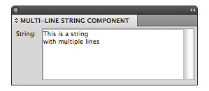
Multi-line String Components
String components can optionally support multiple lines of text, by setting the multiline property to true. The dimensions of the text area are defined by rows and columns instead of length:
- rows defines the amount of visible lines of text in the text area. Due to a bug in Illustrator's Interface, values bellow 6 cause problems with scrollbars on Macintosh. The default is 6.
- columns defines the average amount of characters per line visible in the text area. The default is 32.
var components = {
	string: {
		type: 'string', label: 'String',
		value: 'This is a stringnwith multiple lines',
		multiline: true, rows: 6, columns: 32
	}
};

var palette = new Palette('Multi-line String Component', components);
Number Components
Number components work in the same way as string components, but only accept numerical values. They support these additional properties:
- range defines the range for the numeric value as an array in the form: range: [min, max]. The first element in the array defines the allowed minimum amount, the second the maximum amount, both are included in the range.
- steppers activates little stepping arrows on the side of the field if set to true.
- increment The amount the steppers are increasing / decreasing the value. Even when steppers are not activated, the user can still use the up/down arrow keys to step by the amount defined by increment.
- units The units to be displayed behind the value. These values are allowed: 'none', 'point', 'inch', 'millimeter', 'centimeter', 'pica', 'percent', 'degree' and 'pixel'
- fractionDigits The amount of digits after the decimal point. If finer grained values are entered, they are rounded to the next allowed number. The default is 3.
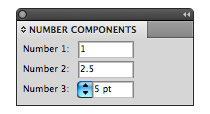
var components = {
	number1: {
		type: 'number', label: 'Number 1',
		value: 1
	},
	number2: {
		type: 'number', label: 'Number 2',
		value: 2.5,  fractionDigits: 1, increment: 0.5
	},
	number3: {
		type: 'number', label: 'Number 3',
		value: 5, range: [0, 10],
		steppers: true, units: 'point'
	}
};

var palette = new Palette('Number Components', components);
Text Components
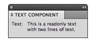
Text components are there to display non-editable text, for messages or titles of groups of components. They can contain line breaks.
var components = {
	text: {
		type: 'text', label: 'Text',
		value: 'This is a readonly textnwith two lines of text.'
	}
};

var palette = new Palette('Text Component', components);
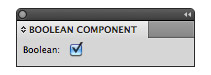
Boolean Components
A boolean component is a checkbox that can be checked or unchecked, toggling a boolean value between true and false. It does not offer any additional properties.
var components = {
	checkbox: {
		type: 'boolean', label: 'Boolean',
		value: true
	}
};

var palette = new Palette('Boolean Component', components);
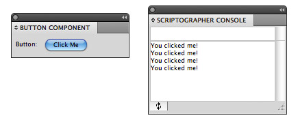
Button Components
Button components appear as normal buttons inside the prompt dialog, with value as text that appears on the button. When clicked, they fire an onClick() event, which can be handled by a provided function.
var components = {
	button: {
		type: 'button', label: 'Button',
		value:'Click Me',
		onClick: function() {
			print('You clicked me!');
		}
	}
};
var values = Dialog.prompt('Button Item', components);
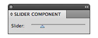
Slider Components
Sliders are horizontal controls that allow the user to choose a value in a given range by dragging the slider handle. They can be configured by a row of properties:
- width defines the width of the slider in pixels. The default is 160px.
- range defines the range for the numeric value as an array in the form: range: [min, max]. The first element in the array defines the allowed minimum amount, the second the maximum amount, both are included in the range.
- increment The steps between allowed values, quantizing the range.
var components = {
	slider: {
		type: 'slider', label: 'Slider',
		value: 5, range: [0, 25]
	}
};

var palette = new Palette('Slider Component', components);
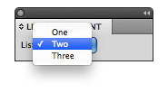
List Components
List components appear as popup menus, offering a multitude of options of which one can be chosen. The value property defines the currently selection option, whereas options defines the selection of values to choose from as an Array.
var components = {
	button: {
		type: 'list', label: 'List',
		value:'Two',
		options: ['One', 'Two', 'Three']
	}
};
var values = Dialog.prompt('List Item', components);
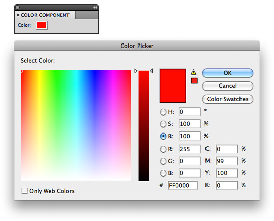
Color Components
Color components are small color buttons that bring up a color chooser when clicked. Just like in the rest of Scriptographer, the color value can either be provided as a Color object or a String either defining a color name or a color hex value. The component returns a Color value.
var components = {
	color: {
		type: 'color', label: 'Color',
		value:'#ff0000'
	}
};
var values = Dialog.prompt('Color Item', components);
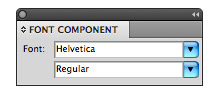
Font Components
Font components are a convenient way to offer the user a font chooser. A font component consists of two list components that are automatically filled by Scriptographer. The first list contains all fonts installed in the system, the second list shows the weights for the currently selected font. Just like in the rest of Scriptographer, the value can either be provided as a FontFamily object, a FontWeight object, or a String defining the font's name. The component returns a FontWeight value.
var components = {
	font: {
		type: 'font', label: 'Font',
		value: 'Helvetica Regular'
	}
};

var palette = new Palette('Font Component', components);
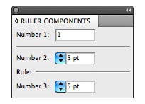
Ruler Components
Ruler components are used to visually separate other components, as a means to create order in complex interface layouts. They optionally support a label, which will appear aligned to their left, partially hiding the ruler line.
var components = {
	number1: {
		type: 'number', label: 'Number 1',
		value: 1
	},
	ruler1: {
		type: 'ruler'
	},
	number2: {
		type: 'number', label: 'Number 2',
		range: [0, 10], units: 'point', steppers: true,
		value: 5
	},
	ruler2: {
		type: 'ruler', label: 'Ruler'
	},
	number3: {
		type: 'number', label: 'Number 3',
		value: 5, range: [0, 10],
		steppers: true, units: 'point'
	}
};

var palette = new Palette('Ruler Components', components);
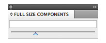
Full Size Components
There is also the possibility to set the fullSize property to true on any of the component types, resulting in the component consuming the full width available and not showing a label to its left:
var components = {
	string: { type: 'string', fullSize: true },
	slider: { type: 'slider', fullSize: true }
};

var palette = new Palette('Full Size Components', components);
Separating Values from Component Definitions
In all the above examples, we have defined the default values inside the interface components. For real world use, it is often far clearer and more useful to define them in a separate values object, which is then passed to Palette.new(title, items, values) or Dialog.prompt(title, items, values) as a third parameter.
The values object is continuously updated whenever the user changes values, so the script can simply keep referring to it for up-to-date values. This is a very convenient way for working with values changed in palette windows.
The last example above would then be rewritten in this way. See the tutorial Creating Palette Windows for examples of the advantages of the values object.
// Define the values object, declaring default values and also
// receiving the user changes, for simpler further reference:
var values = {
	number1: 1,
	number2: 5
};

// Define the interface components to edit each value. Note that they
// need to use the same names as the properties in the values object:
var components = {
	number1: {
		type: 'number', label: 'Number 1'
	},
	ruler: {
		type: 'ruler'
	},
	number2: {
		type: 'number', label: 'Number 2',
		range: [0, 10], steppers: true, units: 'point'
	}
};

// Now we create the palette window using the components
// and values definitions:
var palette = new Palette('Ruler Component', components, values);